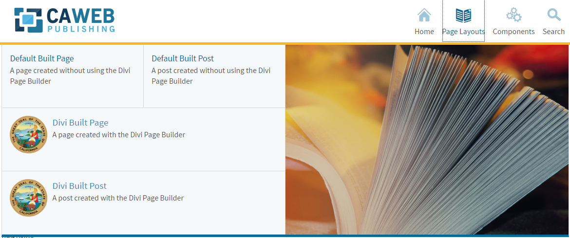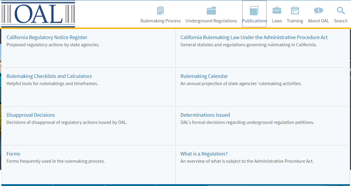
The Megadrop navigation menu provides a large menu that becomes the center of attention when a user goes to navigate through your site.
Options:
- Unit 1 – This option is 1/4 of the width of the drop down area and does not allow for a link description to be placed below. This option is 1/2 the height of the other options.
- Unit 2 – This option is 1/4 of the width of the drop down area and does allow for a link description to be placed below.
- Unit 3 – This option is 1/2 the width of the drop down and allows for a description and an optional image to be placed.
- All drop down links can have an icon placed next to them.

The megamenu displays dropdown panels for sub navigation when the user hovers over a primary link. This style of menu can be set by including the .megadropdown class in the <nav> element.
Example:
<nav id="navigation" class="main-navigation megadropdown"> .
In the template distribution this markup can be found in /ssi/navigation.html.
Fixed Units
When you open the mega menu, you may notice a table or grid like look to the sub nav links. In order maintain the grid look the items need to have a .unit class applied. Each unit increment multiplies it’s base value by it’s unit value.
.unit1= 50px.unit2= 100px.unit3= 150px
Units become useful when you wish to mix various content into the mega menu while maintaining the grid-like look. For example, a link with a description would likely use a .unit2 class making it twice as tall as a link with a class of .unit1
Mixed Content Within Navigation
The megamenu allows for the display optional images or promoted content to the left or right of the sub navigation links. It is also possible to display a short description below each sub navigation link. Use .with-image-left or .with-image-right on the grid container containing the media.
Using Columns
The megamenu uses the available grid classes to divide the menu into multiple columns seperating links from media or promoted content. It’s not without it’s limitations. For example, images or mixed content may be on the left or right of the links, but cannot split links.
Positioning
When positioning an image or promoted content on the left an .offset-[value] class must also be applied to the link’s grid container. The offset value is equal to the images grid container.
Attention
On any page with this message displayed you can click the button to view this page in the Version 4 format.
